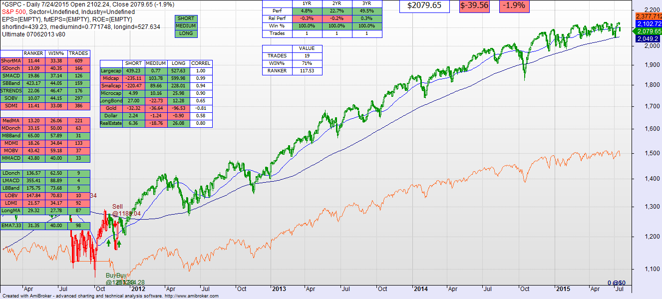
There continues to be some underlying decay in the market — note below that small and mid-cap indices are showing short term weakness in the technical model, while large caps (usually the last to fall) are still ok despite the Friday drop.
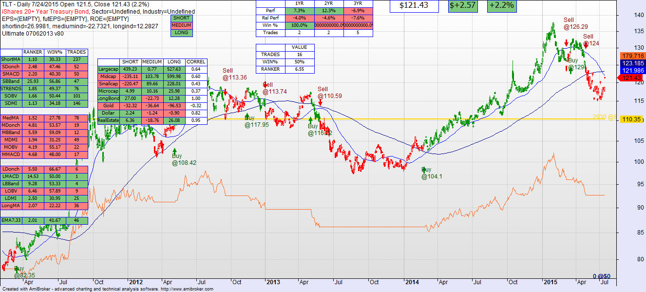
Long bonds have not recovered technically and are still problematic, although better performing in the immediate term. The technical model is still not showing an intermediate BUY signal on them yet.
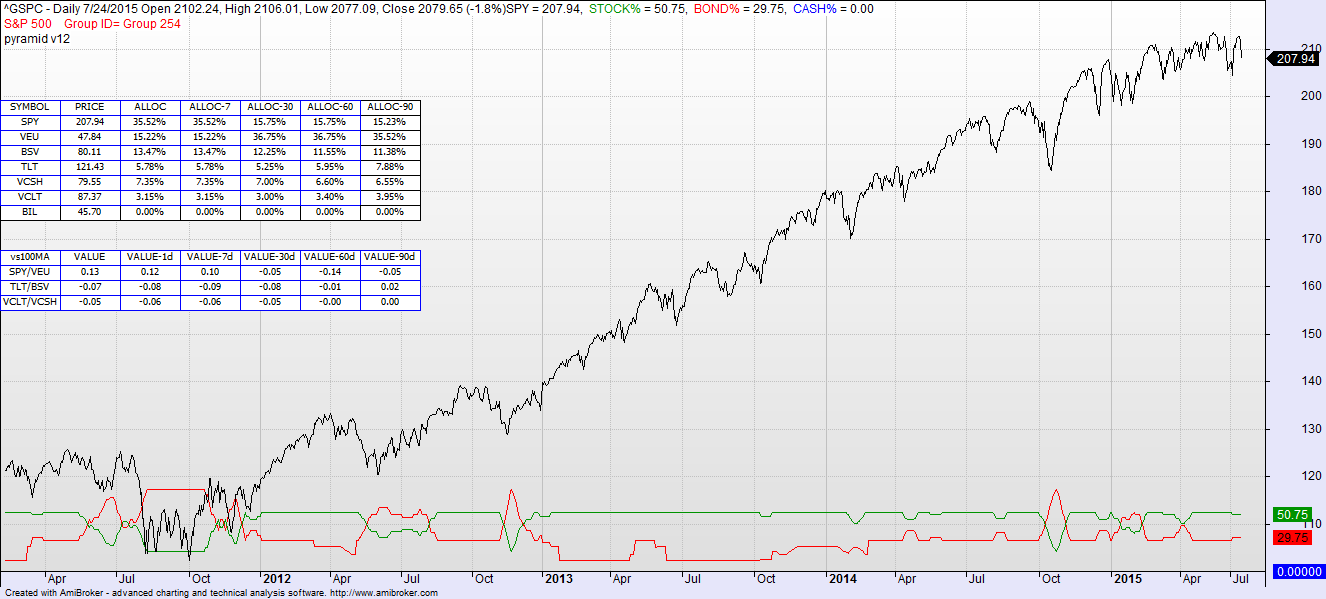
Overall asset allocation remains unchanged from last week.
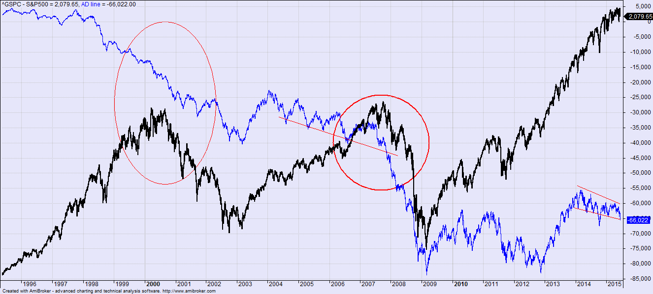
The interesting thing about this environment is not the immediate future but the potential building of a downward trend. The BLUE line in the graph below (which goes back to 1996) is the accumulated total of advancing minus declining stocks in the Nasdaq Composite. When you look across all companies on the NASDAQ there has been a net-declining situation since 2014, while the cap-weighted index continued to rise (the bigger companies leading the charge). In the past when the majority of companies on the NASDAQ have not been rising, that inevitably leads to a downward correction in the market. Note that although you might wait awhile for confirmation of a change in market tone, you can see that when the A-D line starts to pierce resistance, or when it simply accelerates downward, that is a time for caution.
Everyone knows that this rising market is long in the tooth. There have been analysts and investors burned trying to time the turn in the market too early. Technically and in these numbers below there is simply not enough info to sound the alarm at this point.
But the AD-line is approaching resistance, the small and mid-caps are weakening, the long bonds are strengthening a bit…smells like there might be change coming in the air somewhere. Stay flexible.