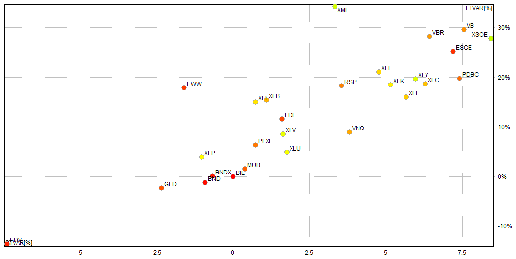
As you know the Retirement ETF algorithm is rather simple, looking for a monthly cross of the 200dMA. The picture below is an XY plot of the ETFs that are in the Retirement portfolio.
On the X Axis is the Percent Variance of the Price to the 50dMA.
On the Y Axis is the Percent Variance of the Price to the 200dMA.
The picture is designed to tell us at a glance where ETFs are relative to the 200dMA, and by looking at the short term variance you can get a picture of where things are probably headed. Anything that is above 0% Long Term but below 0% versus the Short Term average bears watching.
I will refine this more next month.

